


Kyle Cooper, modern pioneer of movie title design, and Jessica Hische, young letterer, illustrator, and typographer, who pushes the envelope of modern and scripted style, are two of the best artists in their fields. Both are passionate about what they do, they pay immense attention to detail as well as become absorbed in their work, and in turn, have inspired an incoming generation of artists and designers. Their drive and work ethic both stem from the idea that they are communicating something to an audience. Stylisticly, however, their works are very different: Cooper tends to lean towards subjects with a darker flair, designing for movies in the action, horror or dark comedy genre, whereas Hische creates handcrafted scripts and typefaces with a modern feel on a variety of products. Some designers would like to work as quickly and efficiently as possible to produce a design that is just “good enough,” and, just as quickly, move on to the next project. Hische and Cooper challenge this, by making a conscious effort to pay attention to each piece carefully. Their results show that expending the energy it takes to do this is well worth it in the end.
Many would not know the name or the face of the man who has created hundreds of the best title sequences of our time, but they would recognize his work instantly. Kyle Cooper, “the man who single handedly revitalized the main title sequence as an art form,” is considered the pioneer of modern movie title design (WatchTheTitles.com). Since 1990, he has created over 150 film titles and visual effects, along with commercial and gaming graphics (IrishTimes.com). Currently, Kyle Cooper is the live-action director, a graphic designer, and an animator at his company, Prologue (Prologue.com). Cooper describes his work as being the “prologues” to films, intertwining the story and feel of the film into two and a half minute mini-films (BUToday.com). Typically, these prologues either set up the plot of the film, or create its overall tone. In some of his pieces, such as Se7en (1995), Cooper sets a specific mood and style for the film to come. In others, such as The Incredible Hulk (2008), he provides a backstory to what has happened since the previous movie in the series (Cordington, 2003; ArtOfTheTitle.com).
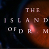
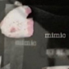
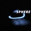
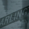
Kyle Cooper found his way into movie titles through Paul Rand, his graduate professor at Yale University. Cooper liked that he was communicating with his audience through moving imagery (DesignWeek.com). Cooper also enjoyed that being as detailed as he wished would further his design, rather than detract from it. Cooper’s claim to fame was his title sequence for the movie Se7en in 1995, which has been described as, “one of the most important design innovations of the 1990s” by New York Times Magazine (WatchTheTitles.com). This title sequence expertly combines typography, still imagery, live action, sound, and timing into a two minute and nine second mini-film that some argue is better than the actual movie. This has also been said of his other early works such as The Island of Dr. Moreau (1996), Twister (1996), Donnie Brasco (1997), Mimic (1997), Sphere (1998), The Mummy (1999), Arlington Road (1999), and Spider-Man (2002).
These early title sequences convey to the audience a great deal of information about Cooper’s work ethic, drive and style. Kyle Cooper is an incredibly detailed worker; he is relentless in his pursuit of his final vision. In Se7en (1995), in order to achieve a hand-scrawled look, Cooper scratched the names of the cast and crew into the film stock, by hand, frame-by-frame. For The Island of Dr. Moreau (1996), Cooper strung together 400 shots of biology and anatomy, all for just a 40 second sequence. In preparation for the film Mimic (1997), he studied insect physiognomy and traveled to bug fairs and natural history museums to understand the intricate images he planned to use. To create the distinct feel of his typography for The Mummy (1999), Cooper did extensive historical research to create a part-roman-letter-part-heiroglyphics typeface. For Marvel Comics and Spider-Man (2002), Kyle digitally scanned dozens of vintage Marvel comics to create a ten second montage that has now become an iconic “logo” for the comic book company (Wired.com).
In terms of work ethic, Kyle Cooper likes to be involved in every part of the process from start to finish. He even left his old company, Imaginary Forces, in 2003, to begin his own company, Prologue, because it so greatly bothered him to be sending people to designers instead of doing the work himself (Wired.com). Kyle Cooper is a great example and inspiration to today’s upcoming designers in just how dedicated one should strive to be.
Jessica Hische is a 29-year-old illustrator, typographer, and letterer who has made great strides in the realm of digitally-made advertisements, book covers, typefaces, identity design, and a variety of other projects. With a style reminiscent of the 1950s, with the additional use of very curvilinear, hand-drawn scripts, she has joined a small but growing breed of typographers who prefer the hand-lettered style over standard computer typefaces. Jessica Hische is best known for her modern style, as well as her “side projects,” such as the “Daily Drop Cap.” Her resume sports names like Target, Tiffany & Co., American Express, Penguin, and Victoria’s Secret. Jessica has been awarded several accolades: Forbes’ 30 Under 30 (twice), ADC Young Gun, and GDUSA Person To Watch. She says that when she is not working, she “procrastiworks,” where she fills up her free time with mainly web-based side projects. This is where some of her most interesting pieces have come from: “The Daily Drop Cap,” “ Should I Work For Free: A Handy And Humorous Flow Chart,” “Jess & Russ,” and her temporary tattoo designs for Tattly.
In her early career, after exploring every possible artistic option while attending the Tyler School of Art at Temple University, she finally settled on graphic design. She loved the idea that as a designer, she was “solving problems, that there were rules to follow, that the point was for people to get what you were trying to communicate” (jessicahische.is/awesome). She later realized that she procrastinated by putting most of her energy into the lettering and illustrations of her projects. In turn, she decided that this was what she should do for the rest of her life. This idea has become a philosophy of hers and been a driving force in her work. This philosophy, known as “procrastiworking” is a great piece of advice that she also gives to aspiring designers and artists (humblepied.com).
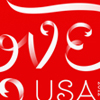
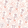
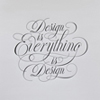
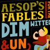
Hische describes herself as a person who “hold[s] a pen like a child holds a crayon(in a tight fist that will only catalyze the carpal tunnel)“ (jessicahische.is/awesome). She does much of her work from her sketchbook and goes straight into Adobe Illustrator, using only a mouse or a trackpad. As previously stated, much of her work either provokes thoughts of the nostalgic 1950s lifestyle or has a very whimsical, light, and organic quality to it; very different to Kyle Cooper’s darker style of typography which uses bolder, slab-serif or serif typefaces. In several of her pieces, including “Ribbon Type Patterns,” “Washington State Lottery,” and “Love Stamp,” she displays her ribbon lettering technique, which is a sort of ode to cursive writing with a decorative flair. Hische has also designed lettering which uses nature as inspiration, involving letters that resemble branches and vines, as in “The Art of Plants” and “Love Your Heart.” At the other end of her aesthetic, she has letters that are on the extremes of thicks and thins, for example, “You’re My Pinspiration,” “Elizabeth Gilbert's Novel,” and “Design is Everything,” compared to “Barnes and Noble Classics,” “Harry Pottery,” and “Aesop’s Fables.” In addition, Hische has created typefaces that resemble existing ones designed by other typographers, such as Paperback, Serifa, and Bodoni, but she completely makes them her own. None of her designs rely on the same color palette and each work of art has a distinct yet cohesive feel to her overall body of work.
Hische’s energy, passion, and attitude towards her own work, is probably what is most refreshing about her. She comes across as humble and eager to help out those who wish to follow a similar path in graphic design. On her website, she states, “being a nice and genuine person will get you so much farther than your portfolio will” (jessicahische.is/awesome). It is heart-warming to see someone in the professional art world who is ready and willing to help others succeed, rather than worrying solely about her own success. This would probably be the only difference in work ethic that Kyle Cooper and Jessica Hische have; one is very protective about his work while the other is more free, and it shows in each of their aesthetics.
These two designers, although very different in how their work is presented, as well as in style, are extremely similar in why they do what they do. They both wish to communicate to their particular audience, whether that be in a cinema or in the shops of the malls across America. Cooper and Hische go about their work in similar ways, with sketches, research and instinct. To experience these work together is to see two designers whose end result may be of a different medium and style, but whose process in getting there is much the same.